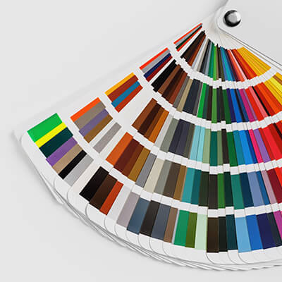
The color scheme of your favorite coffee shop, office or retailer didn’t come to fruition on a whim. The hidden recesses of the brain are the most sought-after real estate that marketers pine for. In fact, any corporation worth their salt is likely to have spent a lot of time evaluating the exact shades and hues that comprise their brand and logo. The same holds true for their interior office environments. Smart brands take a holistic approach to design. One must consider factors like floor plans, lighting, furnishings, and aligning the environment with their ethos. Experts say there is a new frontier of workplace design they are just now tapping into: color. The next time you step into a business, see if they’re trying to tell you something before they sell you something.
Behind McCarthy Nordburg’s Workplace Design
The 4,000 SF offices of this boutique interior architectural design firm, McCarthy Nordburg, are the result of investing energy and time into selecting just the right color palette and theme for their headquarters in the Camelback corridor. The studio/offices are active and manage multiple clients simultaneously. Studies show that stress levels can be elevated under the influence of certain colors, like red or black. Alternatively, neutral colors like green, yellow and white are calming. In fact, colors in general can have an enormous impact on someone’s mood, so designers select them carefully. McCarthy Nordburg needed an environment that balanced calm with creative energy. This is where color comes into play in the interior design. This office design includes a palette of golds and yellows with pops of green and orange. The gold color is introduced in several places because there is something psychologically positive about this color. According to one report, the color gold is the color associated with wealth, success and status. It is the color of achievement and triumph. Gold adds richness and warmth to it’s surroundings — it illuminates and enhances other things around it. Green is the color of balance and growth and orange is the color social communication and optimism. These colors all make people feel lively, energetic and optimistic, whether you’re conscious of it or not. There is no shortage of data detailing the link between the happiness and health of employees and higher levels of creativity and office productivity: that’s why the decision to go with warm tones was an easy decision for us at McCarthy Nordburg. Reports also show that experts are now measuring “biomarkers”. These include brain activity, performance type, reaction times, as well as alertness and self-reported sleepiness, to determine the most appropriate colors for the work environment. They even go on to emphasize that it is important to jumpstart your day with something gold, green or yellow in the room. Consider it an uplifting sunrise effect. From our perspective, we’re future-proofing our office design.
Colors matter. Colors are powerful. Consider them an investment.
By Lisa A. Bentley
Sources


